Every design should be based on some principles that need to be followed. Perhaps the following principles can be interchanged, but these 4 points should always be kept in mind when working on each project – this is a fact. Let’s take a look at them in a little more detail.
1. Visibility
Can I see it?
This is the most basic principle. The more clear and visible functions are, the more likely users will be able to know what to do next.
In contrast, when funstions are “out of sight”, it makes them more diffcult to find and know how to use. Users need to know what all the options are, and know straight away how to acess them.
Example
Problems arise when we can not “see” how to use a device. Consider, for example, auto faucets with sensor technology. How many times have you been not sure how to use it and to guess where to place your hands? Visible knobs, dials and buttons have been replaced by invisible and ambiguous “active zones”.

2. Feedback
What is it doing?
Feedback is about sending back information about what action has been done and what has been accomplished, allowing the person to continue with the activity.
Various kinds of feedback are available for interaction design-audio, tactile, verbal, and combinations of these.
Example
It’s the confirmation that an action was performed. It informs the user that, yes, their input was received and is being acted upon – whether that action is successful or fails is also communicated.
All feedbacks need to be immediate and synchronized with the user action. This enhances the user’s overall experinence, so they aren’t left wondering what happened.

3. Mapping
Where am I and where can I go?
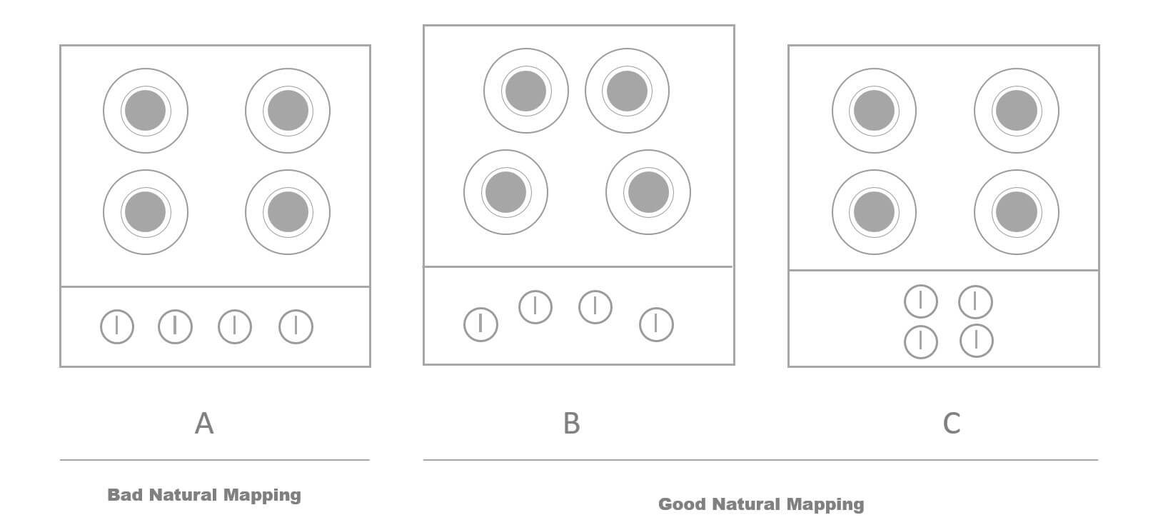
This refers to the relationship between controls and their effects in the world. Nearly all artifacts need some kind of mapping between controls and effects, whether it is a flashlight, car, power plant, or cockpit.
You want this mapping to feel as natural as possible. It should feel natural and intuitive and mimic what we see in the world.
Example
Stovetops are a great exmaple here. When you see the first image, the mapping is not very clear because it’s difficult to determine which control operates each burner. Versus the second and third images, it’s far clearer the control that controls each burner, which has a better mapping.

4. Affordance
How do I use it?
An affordance can be anything. It’s an attribute of an object that allows people to know how to use it.
For web designers, affordance is even more important. Users need to be able to tell how to access information they want from a website, or else they’ll just leave.
Example
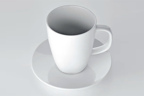
For example, a doorhandle or a cup have high affordance: it’s easy to figure out intuitively how to use it.
A lack of affordance makes for an unpleasent user experience. Without affordance, or with the wrong affordances, the user if left to guessing through trial and error of how to use an object. This takes up time and effort on the user’s part.


